
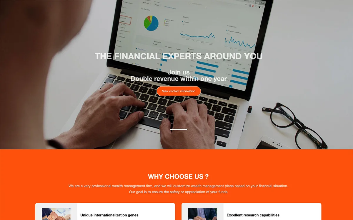
Case studyFinancial advisory firm
Financial Advisory Website
- Financial Services
- Brand Website
- UI Design
- Client
- Financial advisory firm
- Year
- 2023
- My role
- End to end
Client
A financial advisory firm offering stock, fund and futures advisory services to individual and business clients.
Challenge
Financial buyers scan for credibility before they read a word. The brief was to replace a generic corporate layout with something confident enough to hold attention, while keeping the service offer and pricing packages immediately legible.
My role
- Visual direction and color system
- Service and package comparison layouts
- Responsive UI design
- Content hierarchy and call-to-action design
Solution
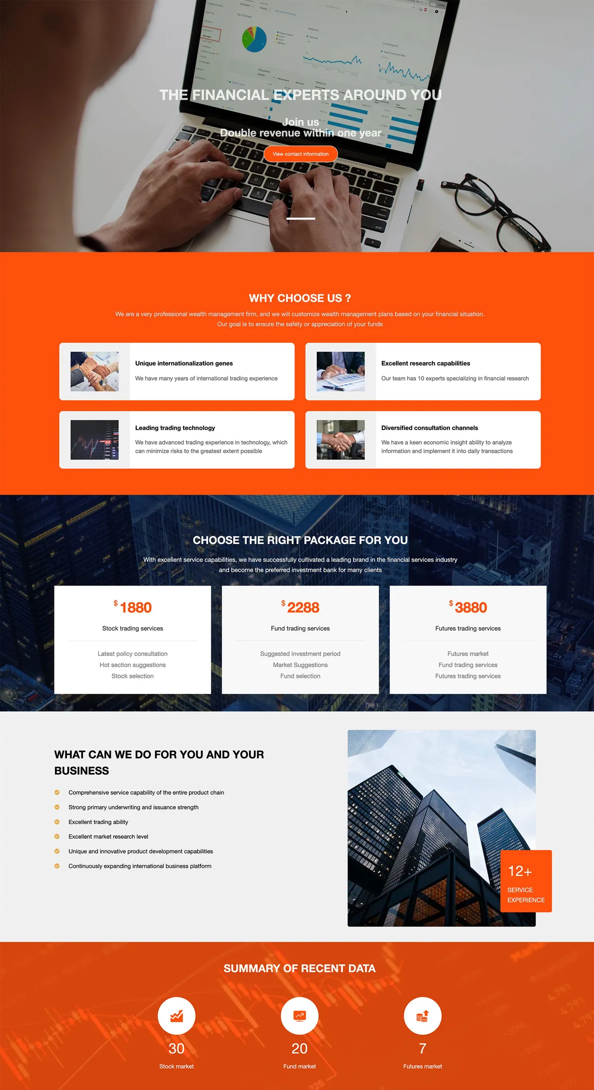
A saturated orange sets the tone and separates the page into clear acts: an image-led hero, four service differentiators, a three-tier package comparison, and a credibility band with firm experience.
Packages are laid out as equal cards with a single highlighted price, so visitors compare tiers without opening a second page. Supporting copy is deliberately short; the page relies on contrast, whitespace and rhythm rather than dense paragraphs.
The preview below covers the page through the data summary; the contact section is omitted.
Tech stack
Design system, responsive layout grid, data-dense card layouts, form UX.
Live preview
The full-page design is shown above. A walkthrough of the original build is available on request.