
Case studySichuan Chuanneng New Energy Development Co., Ltd.
Chuanneng New Energy Website
- Renewable Energy
- Corporate Website
- UI Design
- Client
- Sichuan Chuanneng New Energy Development Co., Ltd.
- Year
- 2026
- My role
- End to end
Client
Sichuan Chuanneng New Energy Development Co., Ltd., a Chengdu-based company founded in 2009 that plans, builds and operates integrated renewable energy systems — shallow, medium and deep geothermal, solar PV and solar thermal — for public, commercial and residential buildings.
Challenge
Present a full geothermal life cycle — survey, design, integration, construction, operations — as one coherent service story rather than five disconnected offers, for an audience that includes government and institutional clients. The site also had to carry a three-category news feed and a busy contact path covering project, channel, technical and hiring enquiries, without adding navigation depth.
My role
- Visual direction and page system
- Information architecture across services and fields
- Hero art direction and bilingual typography
- Bento service cards, stats and news modules
- Contact page layout and enquiry routing
- Responsive layout
Solution
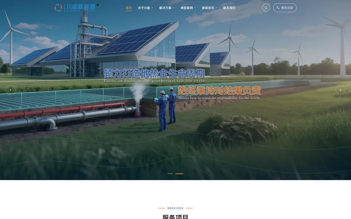
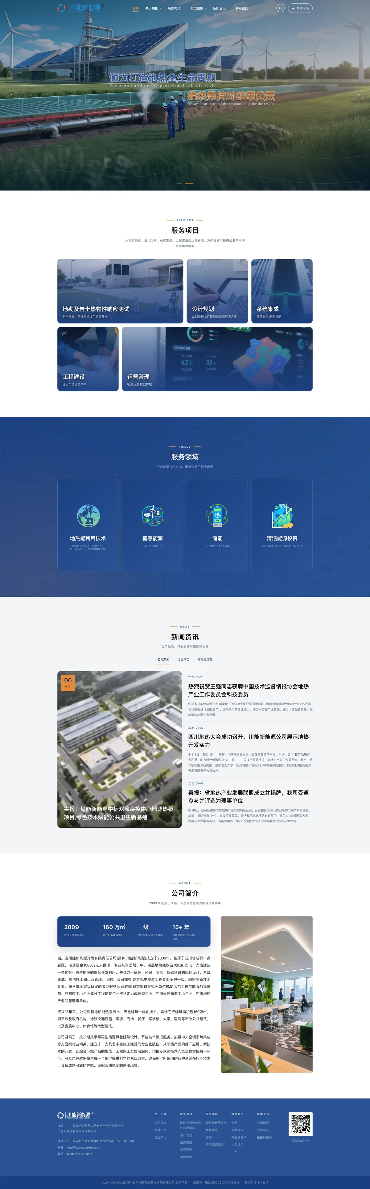
The visual language is built around an engineered, clean energy palette: deep blue fields, a white service bento and a copper accent. The hero carousel puts geothermal infrastructure on screen with paired Chinese and English statements, setting up the bilingual labelling used across service icons and section eyebrows.
Services are arranged as a five-card bento — survey and thermal response testing, design planning, system integration, engineering construction and operations — with the operations card running wide to carry a live dashboard interface. The fields section shifts to a darker blue band with four illustrated cards (geothermal energy, smart energy, storage, clean energy investment) over a blueprint-style background.
A three-tab news module pairs a featured story with a dated list, and the about section sets a four-stat band — founding year, floor area delivered, installation grade, years of experience — beside company copy and an office photograph.
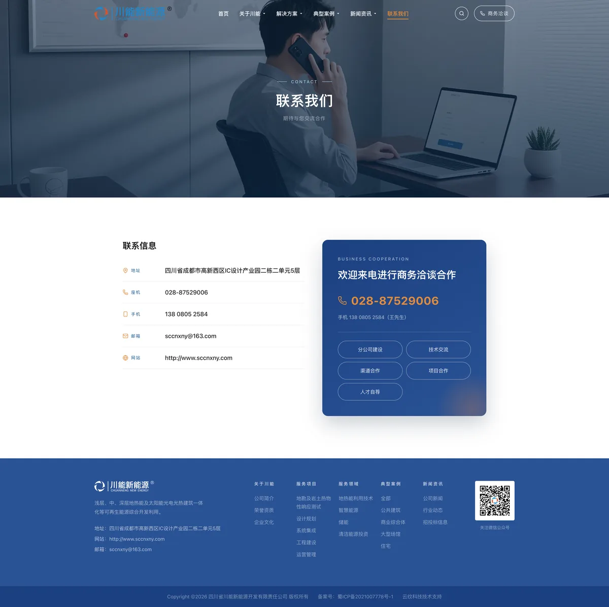
The contact page carries the same system into a split layout: structured contact details on the left and a deep-blue cooperation card on the right, with phone, mobile and five enquiry types set as pill links.
The interface is Chinese-language, with English used for section eyebrows and field labels.
Tech stack
Design system, responsive layout grid, bento service modules, tabbed news feed, contact module.
Live preview
The full-page home and contact designs are shown above. A walkthrough is available on request.